A Unified View for all your calendars - Google Cal, Outlook, Proton, iCal
Built a unified view for professionals to have a full view of their personal life and work schedule.
Role
Product Design, UX Research & Product Management
Timeline
Q1 2026 – Q1 2026
Company
Meetwith
Team
Product designer, PM, Growth, 1 Engineer

Usage Rate
Time to Value
Context
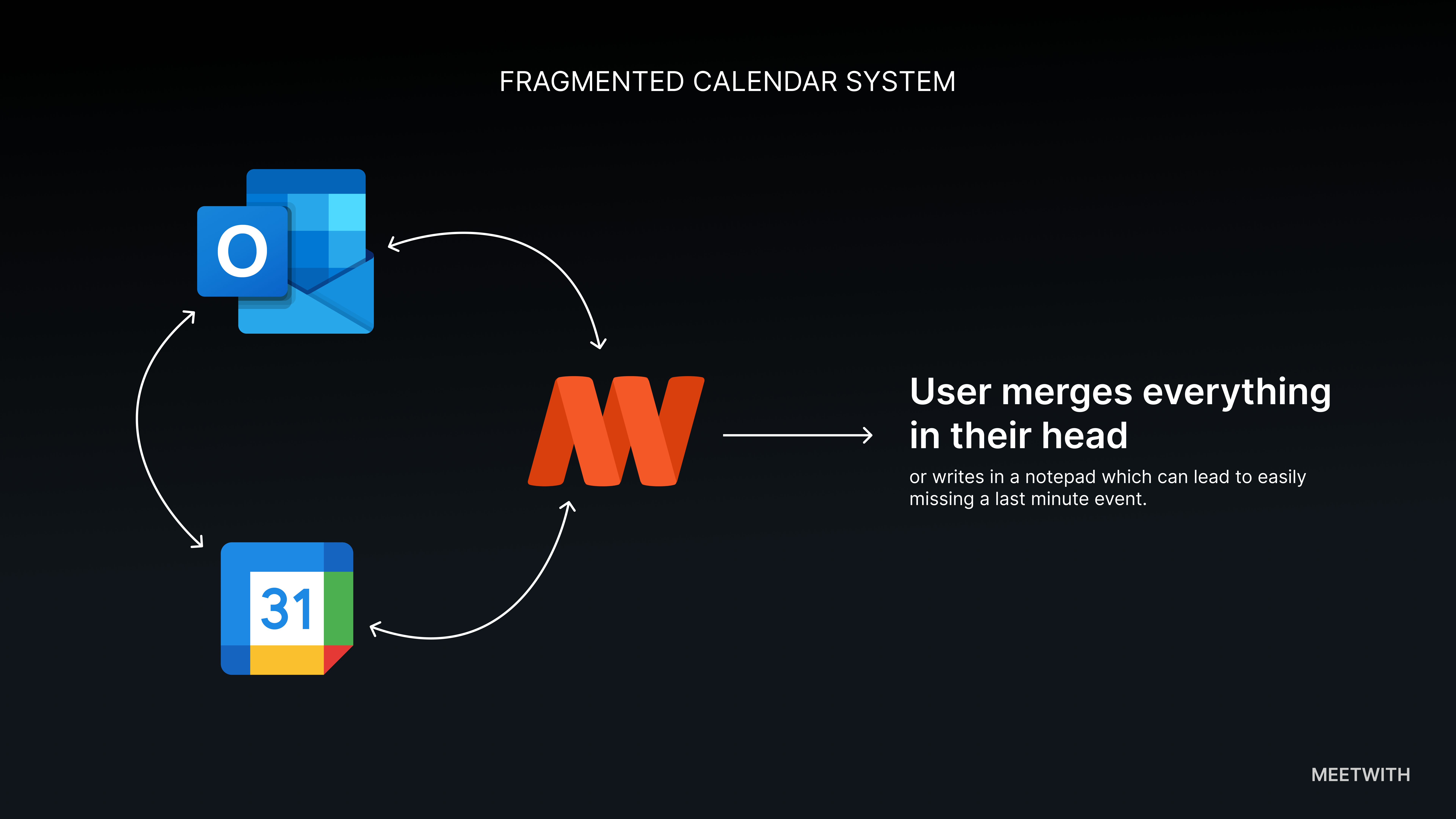
Designing a single view for everything on your calendar. People rarely live inside one calendar. There’s usually a work calendar, A personal calendar, Sometimes another tied to a different email. And then there’s the scheduling tool itself. On paper, calendar integrations solve this. In practice, they don’t because even when calendars are connected, people still leave the product to check their schedule elsewhere. This project started with a simple observation: Meetwith helped users create meetings — but it didn’t yet help them understand their full schedule.
The moment the problem became obvious
Before this feature, something felt off. Users were connecting their calendars to Meetwith. But they were still opening Google calendar/Outlook/iCal to check their day. Which meant one thing: Meetwith was not yet their source of truth for their schedule. It was just another scheduling tool sitting beside their existing calendars.
So even after scheduling meetings in Meetwith, users still had to:
- Open their different calendars
- Cross-check events
- Mentally merge everything
That mental merging was the real problem.
What managing multiple calendars actually feels like
Imagine a typical user. Mark is a COO. He has:
- A work Outlook calendar
- A personal Google calendar
- Meetwith meetings
- Sometimes a second Google calendar — for entertainment activities like soccer.
When Mark wants to understand his day, he does something like this:
- Open Outlook
- Check work meetings
- Open Google calendar
- Check personal events
- Mentally merge both timelines
This obviously requires a lot of effort and it’s easy to miss overlaps.
The question we asked
Instead of asking:
How do we improve calendar integrations?
we asked a better question:
What if Meetwith simply showed users their entire schedule?
not just Meetwith meetings, everything.
Design principle
Time should come before platform. Users don’t care where an event came from. They care mostly when it happens. So the interface shouldn’t group events by calendar. It should group them by date/time.
This led to the core design decision:
One timeline = a list of all events. With a supporting calendar view for those who love the good ol calendar view
The solution
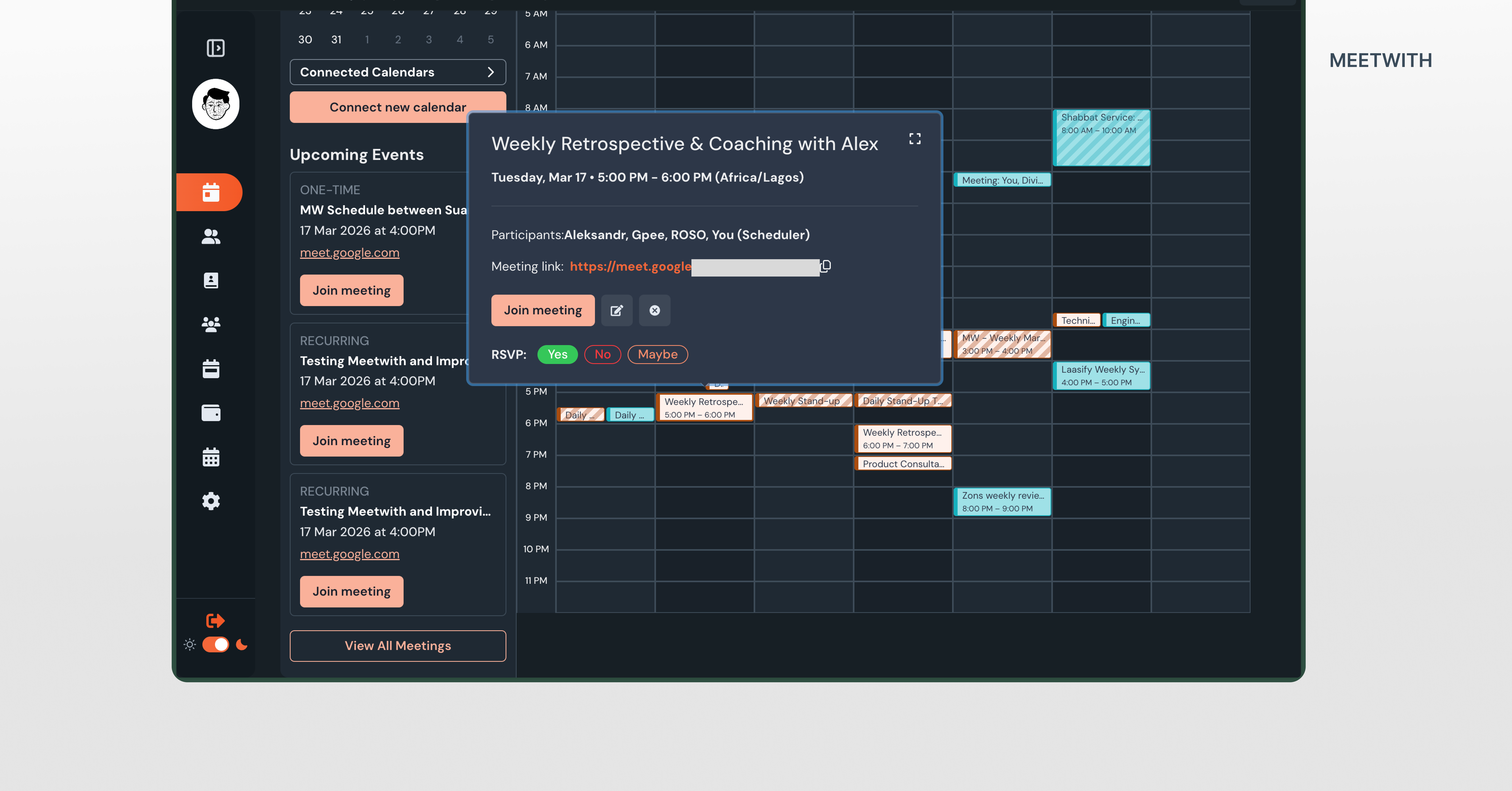
We introduced Unified schedule.
A single view where users can see every event across every connected calendar.
Meetwith fetches events from:
- Google calendars
- Outlook calendars
- Meetwith meetings
Then merges them into one chronological list. The user doesn’t have to be switching tools again. No mentally merging availability to keep track of schedule. Just one timeline.
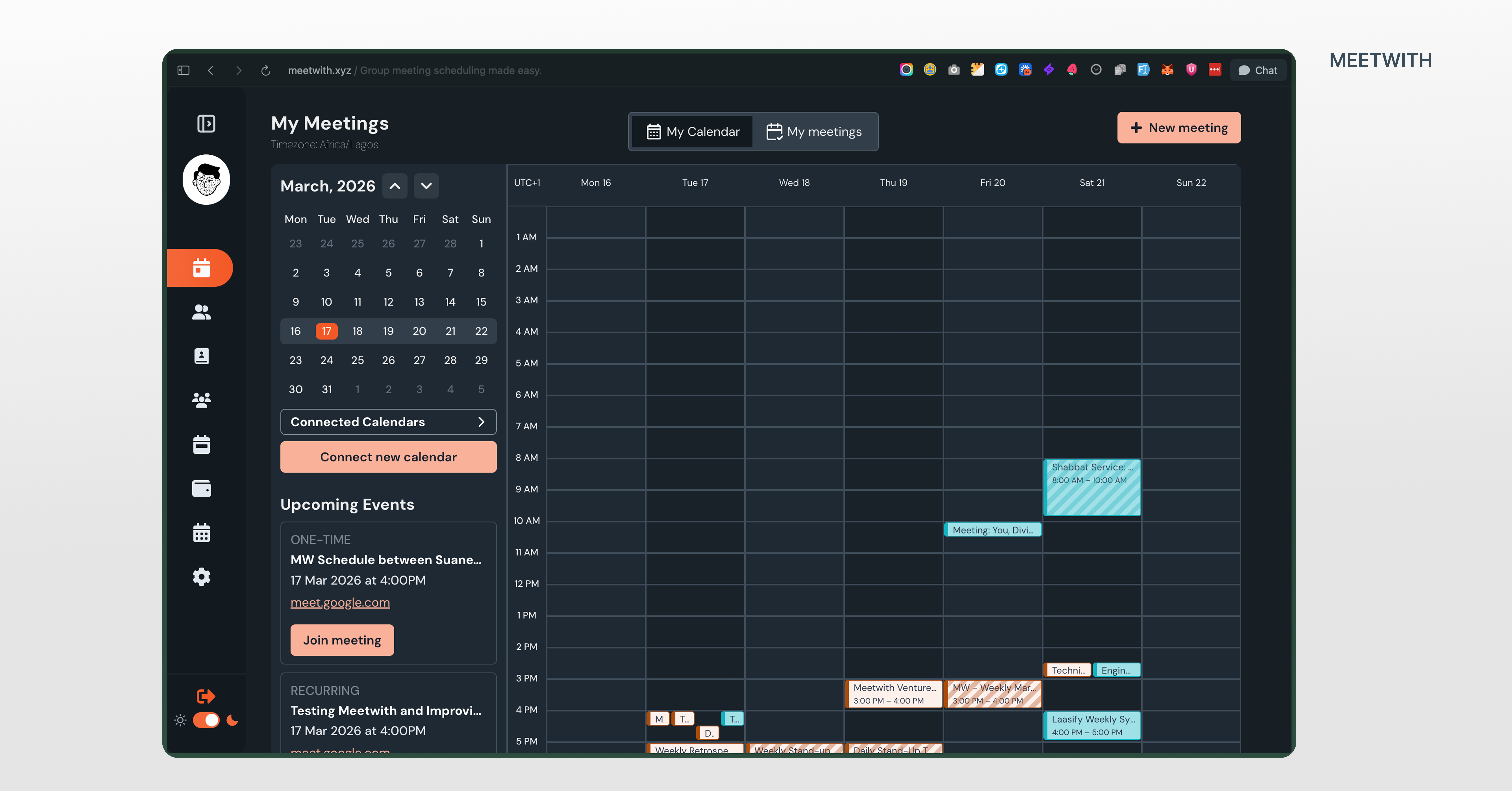
The interface
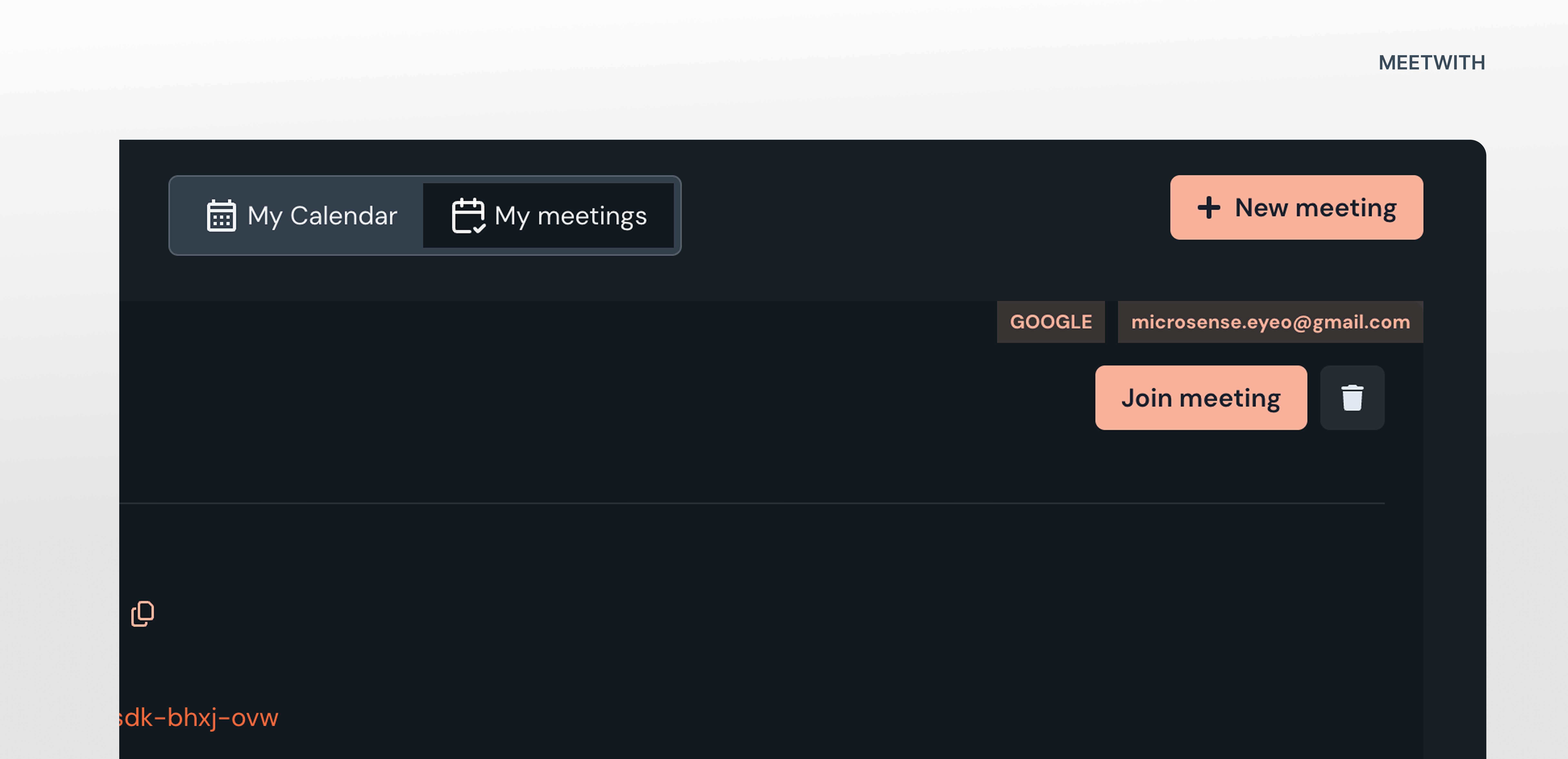
inside Meetwith, the My Schedules page now includes:
- My Calendar
- My Meetings
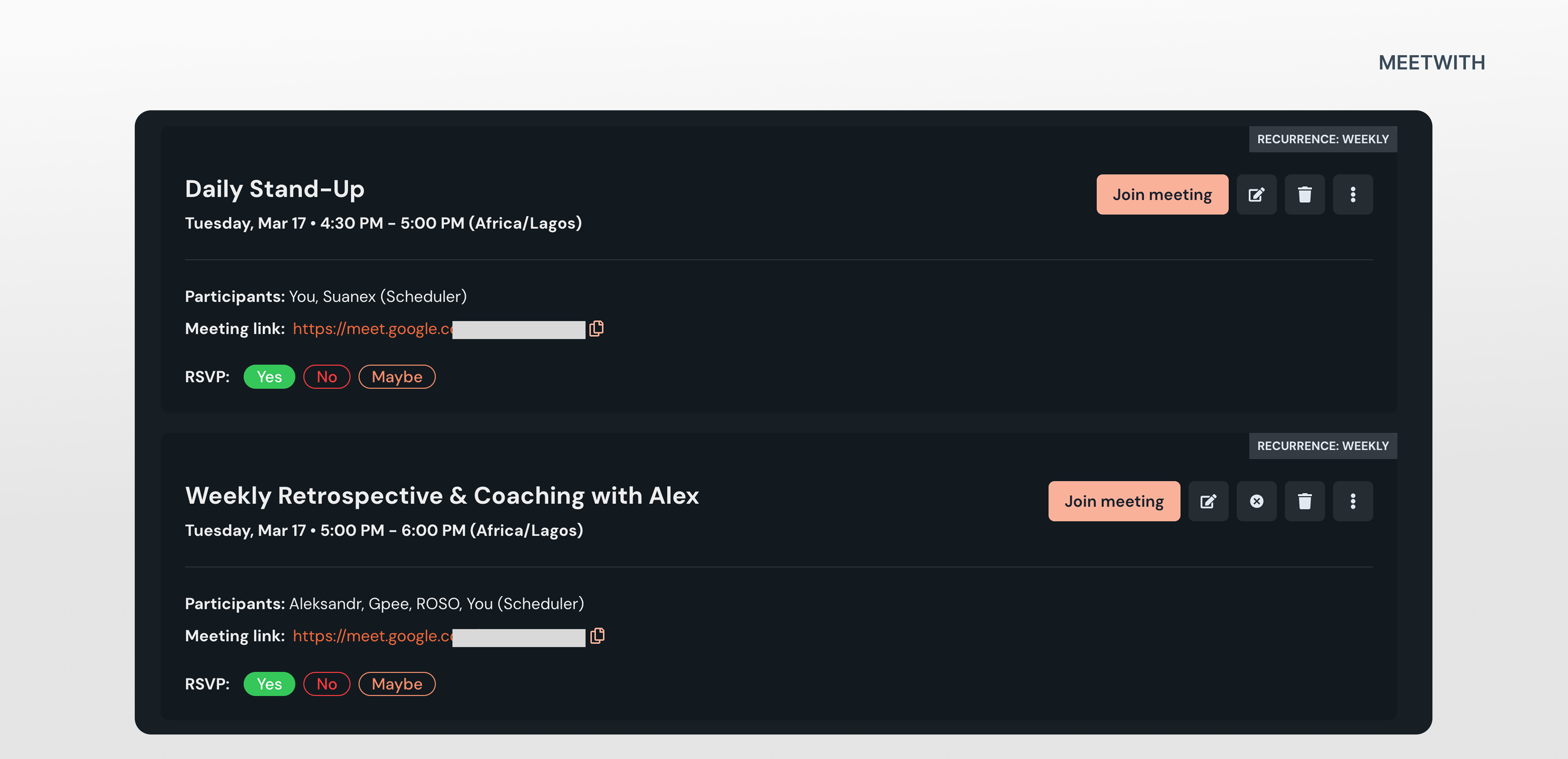
The unified schedule appears as the primary view.
Each event card shows: title, date and time, participants, meeting link, calendar source.
Events from different calendars appear together in chronological order.
Transparency without clutter
While our users care about time first, they still need to know where events come from. So each event includes a subtle label:
Meetwith
Google – sinachpat@gmail.com
Google – patricksinach@gmail.com
Outlook – sinachpat@outlook
This solves another real-world issue: many professionals manage multiple accounts on the same platform.
Making the timeline actionable
A schedule view shouldn’t just display events. It helps users act. So every event allows users to:
- Join Meeting
- Open event details
- Edit Meetwith & Non-Meetwith events
- Sync all changes
This turns the schedule into a control surface, not just a list.
Edge cases we had to solve
Calendar systems introduce complexity. Two scenarios required special attention.
Overlapping meetings
When events overlap, the interface pairs them side by side to show the conflicting of events.
This helps users detect scheduling collisions/duplicates immediately.
Multiple calendar accounts
A single user might connect several Google accounts.
So instead of labeling events simply as “Google calendar”, we included the account identity (email address — calendar). This reduces confusion.
Synchronization
A unified schedule only works if it stays accurate.
So we designed the sync layer to ensure:
- Meetwith edits update external calendars
- RSVP responses sync across systems
- Duplicate events are clearly shown.
The goal was simple: Meetwith should never create calendar inconsistencies.
What this changed for the product
Before this feature: Meetwith was primarily a meeting scheduling tool.
After it: Meetwith started behaving like a time dashboard.
Users could now open Meetwith and instantly understand their day.
Which quietly changes how often they return to the product.
Something interesting we discovered
During testing, some users said they’ll want to see all their events in the list view of the feature instead of just Meetwith meetings as it was before. Reason being that their their calendar didn’t just contain meetings. It contained work blocks.
Things like: writing reports, preparing presentations, deep work sessions, social activities. This helps them know in chronological order the next thing on their plate to do.
This opened a potential future direction:
What if the schedule also supported tasks? Turning Meetwith into something closer to a time planning system, not just a meeting scheduler.
On the short term, we included a section that shows the top 3 upcoming events.
Reflection
This cycle reinforced something important. Most productivity problems are not about missing features. They’re about missing clarity.
Users didn’t need more calendar tools, they needed one place that made their schedule visible.
This also showed that the most powerful product improvement isn’t adding complexity. It’s removing the need for users to think.
Filed under